

user experience
Pendleton Woolen Mills
OVERVIEW
Worked from start to launch of Pendleton’s website re-platform and total redesign of the site to accommodate the modern e-commerce experience and cater to a growing customer base.
CHALLENGE
I played an integral role in creating the site’s new style guide, which allows for a clean, responsive design and follows ADA and UI/UX best practices. In my role, I collaborated with development teams to make the website come to life. These design and functionality changes have contributed to massive revenue growth for the company.
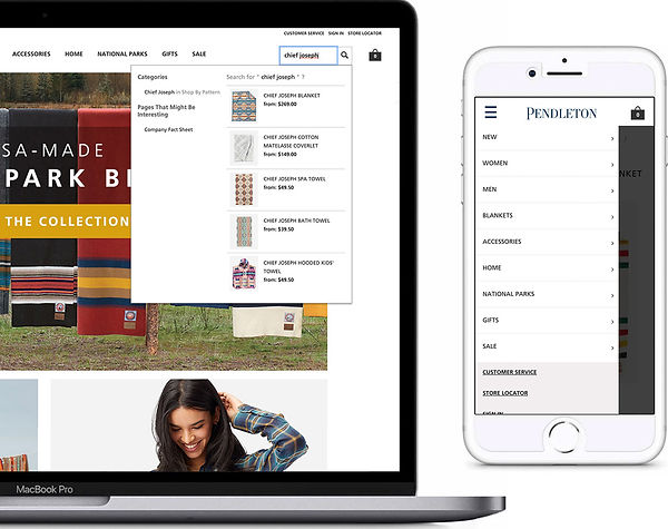
SEARCH SUGGESTIONS
+ MOBILE NAVIGATION
Site heat maps show that many customers rely heavily on both our site search as well as our navigation menu to guide them through the site. I designed the mobile navigation to be clean so the shopper can easily focus on where they are going without being overwhelmed with Pendleton’s many product offerings.
The search suggestion feature helps the customers find and get to the product they came for quickly, which has improved Pendleton’s PDP to Cart rate significantly.

LARGE DISPLAY
+ FONT TREATMENT
Pendleton’s customer analysis shows their customers skew older, but the younger customer base is rapidly growing. Keeping this in mind, we prioritized visibility and legibility in designing both the product list and product detail pages.
The large images and bold font treatment are used to accommodate the older customer, while still appealing to the younger customer’s interests - color and pattern. The simple design helps bring focus to the beautiful products as well as clear guidance for the customer so they can continue down the funnel.